A keyboard can be one of the most visible parts of a desk. It may need to look at home beside a minimalist monitor, add character to a gaming setup, or appear polished on camera during a stream. The best-looking keyboard is not necessarily the most elaborate one, however. Good design comes from combining visual balance with a comfortable layout, dependable construction, and a typing experience that suits the way you work. If you like this stylish keyboard, check our keyboard reviews hub for detailed comparisons and buying advice.
This guide covers the design choices that matter, the most popular keyboard styles, and practical ways to find an attractive mechanical keyboard without spending more than your budget allows.
What makes a keyboard look good?
Keyboard design is shaped by more than its color. The relationship between the case, keycaps, legends, lighting, and layout determines whether the finished product feels intentional or cluttered.
- Color scheme: Monochrome, neutral, pastel, and high-contrast combinations can all work well when the colors are used consistently.
- Case shape: A slim bezel and carefully proportioned case often create a cleaner appearance than unnecessary visual details.
- Keycap profile: Low-profile or sculpted keycaps change both the silhouette and the feel of the keyboard.
- Materials and finish: Textured plastic, coated surfaces, and metal cases each create a different impression. The finish should complement the rest of the workspace.
- Cable and lighting: A tidy cable route and restrained lighting can make a board look more refined than excessive decoration.
Construction also affects appearance. Uneven gaps, loose keys, rattling stabilizers, or a poorly fitted case can make an otherwise attractive keyboard feel unfinished. A visually simple board with solid assembly may look more premium than a heavily decorated model.
Keyboard styles to consider
Minimalist and modern
Minimalist keyboards usually emphasize neutral colors, clean lines, compact bezels, and limited branding. They are a natural fit for uncluttered desks and professional workspaces. A 65 percent or tenkeyless layout can preserve the main typing and navigation keys while reducing the amount of space occupied by the board.
Retro-inspired
Retro designs often use beige, cream, brown, or muted accent colors, along with rounded or vintage-style legends. This look can add warmth to a desk and works especially well when paired with natural wood, leather, or similarly textured accessories.
Gaming and expressive
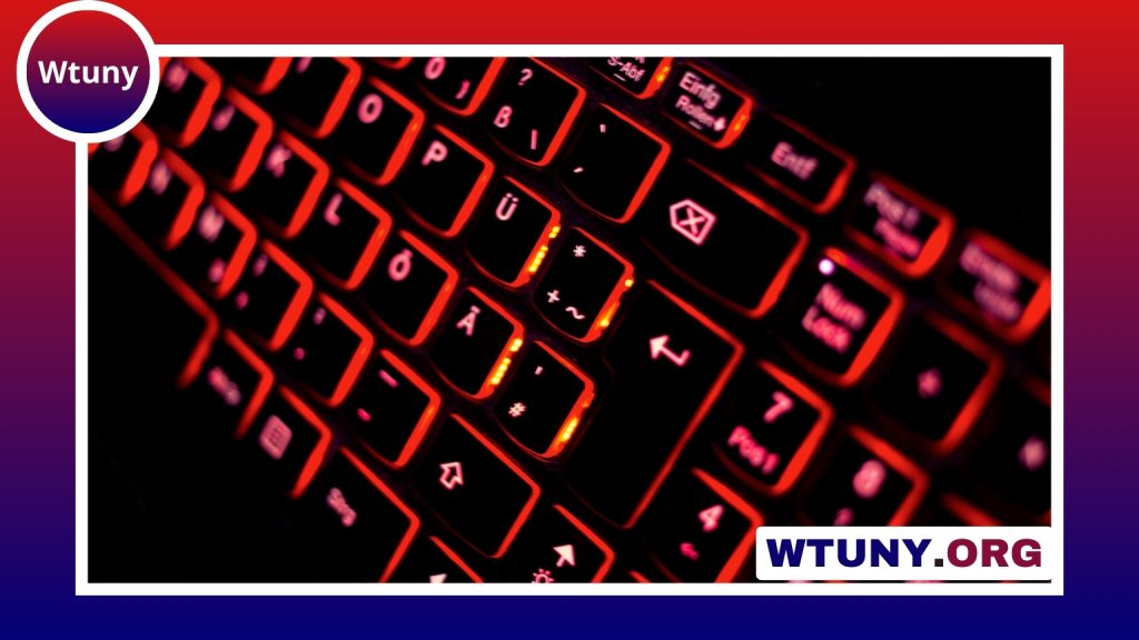
Gaming keyboards commonly use bold color combinations, programmable backlighting, and distinctive case shapes. RGB lighting can be a useful design feature, but it does not need to be bright or animated at all times. A single color, a soft gradient, or lighting limited to selected keys can create a more controlled appearance.
Custom and artistic
Keycap sets and artisan keycaps offer an easy way to personalize a standard keyboard. A themed set can change the entire character of a board, while one or two sculpted accent keys can add personality without making the layout visually busy. A coordinated wrist rest or desk mat can complete the look. Compare keyboard folio designs with the Magic Keyboard to find a stylish match for your setup.
Look for performance as well as appearance
A keyboard that looks good but feels unpleasant to use will quickly become a poor purchase. Before choosing a design, decide what kind of typing experience you prefer:
- Linear switches provide a smooth keypress and are often favored for uninterrupted movement.
- Tactile switches offer a noticeable bump that can make each press feel more deliberate.
- Clicky switches add an audible click along with tactile feedback, although their sound may not suit a shared workspace.
Layout is equally important. A compact keyboard may improve desk space and create a cleaner composition, but it can require shortcuts for keys found on a full-size model. If you regularly use a number pad, dedicated navigation keys, or function rows, make sure the design does not force inconvenient compromises.
Also check the quality of the larger keys, including the space bar, shift keys, and enter key. Stable, quiet movement contributes to a more polished experience. Hot-swappable switches, replaceable keycaps, and a detachable cable can make future maintenance or customization easier.
Finding an attractive mechanical keyboard under 200
When shopping within a budget of 200, focus on the features that affect everyday use rather than paying solely for a premium name or unusual colorway. PBT keycaps are often valued for their durable texture, while hot-swappable sockets allow switch changes without soldering. These features can make an affordable board more flexible over time.
Product photographs can be useful for judging colors and proportions, but look beyond promotional images. Check the available layout, keycap material, switch choices, connection options, and case construction. A compact board may also provide better visual impact because it leaves more open space around the desk.
Keep the keyboard looking good
Dust, skin oils, and crumbs gradually change the appearance of any keyboard. Removable keycaps make routine cleaning simpler, and a soft brush or suitable cloth can help clear debris from the case. Avoid choosing a finish solely because it looks striking in photographs; glossy surfaces and very light keycaps may show marks more readily than textured or darker alternatives.
Ultimately, a good-looking keyboard should support your habits rather than compete with them. Choose a design whose colors and materials fit your workspace, then confirm that its layout, switches, build quality, and maintenance needs are practical. With that balance in place, the keyboard can become both a reliable daily tool and a defining part of your desk.